Golden Steer
Art Direction & Graphic Design: Maylee Tan
Creative Direction: Cortnee Brown
Photography: Cortnee Brown, Sabin Orr
Ask anyone in Las Vegas what the most iconic steakhouse in town is and you’ll catch wind of ‘The Steer’. This rebranded product experience pays homage to the restaurant’s prestigious history and sprinkles in the glimmer and charm of Vegas.
Packaging
SEASONING PACKAGING
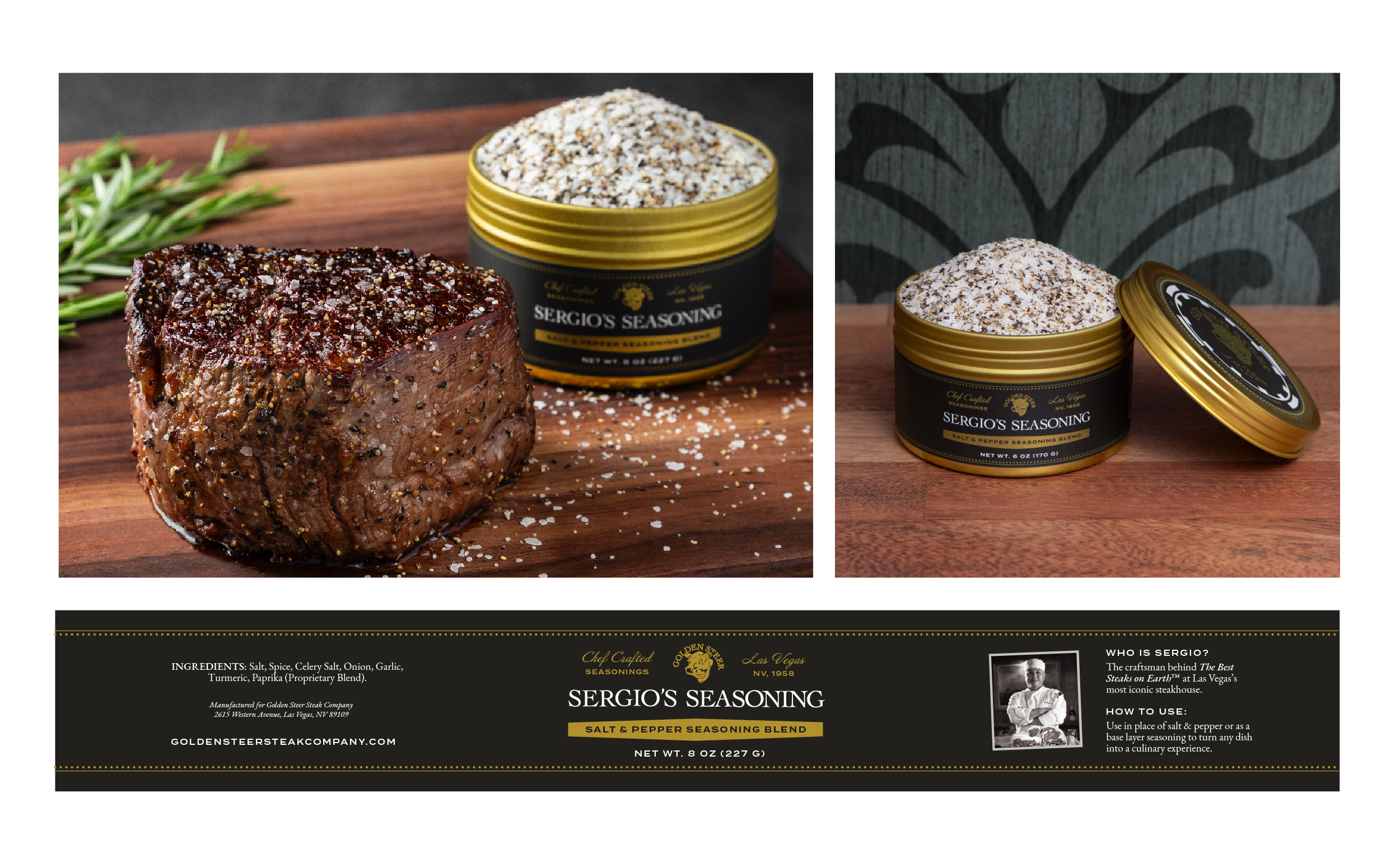
Chaser Lights & Poker Chips
In redesigning the packaging for the brand’s seasoning line, I wanted to imbue the spirit of Vegas and incorporate storytelling elements while working within the limits of a small label.
The goal was to update existing labels to feel more upscale and mirror the personality of the brand.
BUTTERS PACKAGING
Butter, Better.
I designed the brand’s compound butter line to suit the new seasoning packaging by bringing in the color and typographic treatments. However, I found another opportunity to tie in elements from the restaurant, but with more of a focus on the interior of the restaurant.
The script on the butters labels echoes the name plates that title the booths. To match, I introduced the texture of the booth as a background element.
The gold frame treatment, which is echoed throughout the graphic styling of the brand, is inspired by the ornate and gilded stained glass windows in the restaurant.
STEAK LABELS
Las Vegas, Delivered
The vision for the steak labels was to bring the look and feel of the restaurant into the homes and kitchens; what better inspiration to draw from than the iconic restaurant sign itself?
The labels feature a custom shape, designed to mimic the funky silhouette of the physical sign, and topped it with a fleur de lis.


